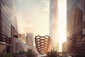
Engaging and interactive, meant to be climbed and explored: Vessel. Created by Thomas Heatherwick and Heatherwick Studio is a new kind of public landmark.

Comprised of 154 intricately interconnecting flights of stairs—almost 2,500 individual steps— and 80 landings, Vessel will lift the public up, offering a multitude of ways to engage with and experience New York, Hudson Yards and each other. In total, Vessel will offer a mile’s worth of pathway rising up above the Gardens.
Influenced by Indian stepwells, made from hundreds of flights of stairs going down into the ground, the dramatic design of Vessel creates a stage set for New Yorkers and visitors from around the world: geometric lattice of intersecting flights of stairs, whose form rises from a base that is 50 feet in diameter that widens at the top to 150 feet. It is constructed of a structural painted steel frame, its underside surfaces covered by a polished copper-colored steel skin. Thomas heatherwick has unveiled plans for an engaging public landmark that will form the centerpiece of new york’s hudson yards development.
Interview by ‘designboom’
designboom: from the outside it seems like there weren’t too many constraints for the project. can you explain the initial design process?
thomas heatherwick: I suppose we see it as a kind of building extension of the public space. in creating a vast new public space there was a high risk of ‘generic-ness’, and building environments can be so similar now. even when buildings are a bit different, the forces that drive retail, that drive residential, and the mix of things that come together to make any new development, are now pretty similar. so the particularity of the space is so important. we’re standing next to a 1,200 foot-high tower in construction, but we’re still roughly the same height humans were 2,000 years ago, when buildings weren’t a fraction of that. so we got more and more passionate about how to keep particularity in the environment around us that is less about shape, but more about the emotional response.
in a way, we saw this as a building made from staircases. there was nothing to commemorate here, and having something that creates a physical engagement creates a chemistry between us. you would probably go a different route than I would. there’s a sort of unspoken choreography as you see each other, in seeing and being seen, and an almost stitched in humor. if something is an unfamiliar experience it draws out different responses from people that can trigger another layer of ways people respond to each other.
so the idea grew from saying: if we have got this space, how can we lift the people up to see each other? — as there is no point trying to compete with a 1,200 foot-high tower. the reason it has a small bottom is to leave as much of the square as clear as possible for things that can happen on the flatter part. so to us, it’s a piece of the square, it isn’t a separate thing. there is a mile of public space, but within that there are 80 human scale spaces. when it is pouring with rain, that would be the place to stay dry.
designboom: new york has seen a number of different types of public space in recent years. how exciting is it to design a new type of public space for the city, that encourages people to engage with it in a different way?
thomas heatherwick: I feel that new york has been pioneering different kinds of public space out of some kind of necessity, because the city was originally planned with one mega public space. the density was so great that there has been a thirst for space. the high line was a kind of shock in its humbleness, and yet in how radical it was. it has no job, it’s not really a route from one place to another, but it’s about human experience. in a way that egged us on to believe that maybe we could make a different kind of public space for the city. the reason the high line is special is that if the same greenery was on the ground it wouldn’t have meaning. it’s the fact that it is raised up that means that your perspective on people and the world around is altered, and different than your usual perspective.
we thought this project was a pretty unusual kind of commission really, whether you like it or not, it will be a different experience of space to have with your friends or by yourself. it shows that humans can do unusual things, and that we can make and create. cities need to keep inventing new environments.
buildings are becoming more similar, and cities are becoming more and more similar. you have to try harder to create real difference, because 50 years ago or 100 years ago, we could travel around the world and towns or cities were different because there was not this global connectivity. now, global procurement and communication means that an office building near the arctic is pretty similar to an office building in a tropical climate near the equator. there is this simultaneous general merging and ‘similar-izing’ of cities, which I find less interesting when I am more passionate about cities that believe that they facilitate human progress.
designboom: is the structure wheelchair accessible?
thomas heatherwick: yes, and it’s not just as a duty. we’re going to have quite an amazing elevator. we’ve designed it with extra love in the details. when have you ever been on a curving elevator? and in fact, when was the last time you walked up 16 storeys? there was a sense that there was a physical dimension and a spatial human scale to this project, and whether you see it as a building or an extension of public space, it is a platform for new york to use and to do what it wants with.
Quelle: designboom
